Font Rendering
- Jun 24, 2015
- By Emil Hall
Dreamler has always been intended to be a real-time native application, with 60 frames per second hardware accelerated graphics and real-time networking. It is technically very much the same as a typical modern PC-game. The core idea and functionality of Dreamler also means that we need to display a lot of text on the screen, more than most games. Of course, displaying text is very common in most computer programs. You’d think it’s essentially a solved problem, so why do I even write this blog post? Because Dreamler lives in the intersection between an action game and a traditional desktop application.
We need to draw an unusually large amount of text on a huge surface, which the user can zoom in and out of at interactive speeds. Zooming is in fact the fundamental user interaction in Dreamler.
Initial attempts
Initially we tried to display text using the standard DirectX functions. We specify the text we want to display, for example the word “Dreamler”. These functions use a font in some vector format (TrueType, OpenType…) and outputs a rasterized picture. The functions are quite slow! Rasterizing text for potentially hundreds of nodes, 60 times per second, was simply not possible with these functions, the resulting speed was only a few frames per second. So what can we do? We could of course rasterize every text to a texture map once, which is slow the first time, but then we can just show the texture map on subsequent frames, which is super fast. Essentially this approach is a form of caching. The question is, when must the texture map be re-generated? It must be re-generated when the user zooms in, otherwise it will look extremely blurry and ugly. And it must also be re-generated when the user zooms out, otherwise we’d end up storing the highest possible resolution of all texts for all nodes, and sooner or later run out of memory on the graphics card. Of course it has to be re-generated every time the text changes, which can happen either due to direct user interaction with the keyboard, or due to new data arriving over the network. If we make any mistake and forget to regenerate the texture in certain cases, our user will see old out-of-date text. All in all, the more we thought about it, the more complex this caching approach seemed. As a famous quote says, cache invalidation is one of the hard problems in computer science. Could we find an easier approach that did not involve caching?
Textures
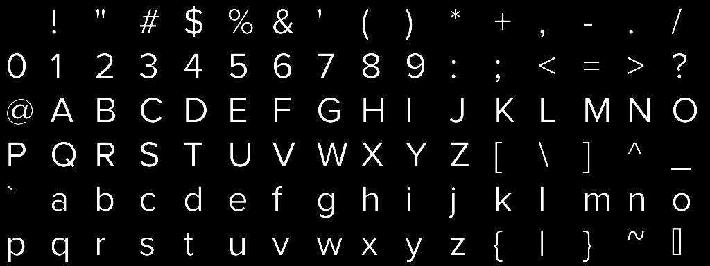
If we could re-render all text 60 times a second, we don’t need any complicated caching. What’s the easiest way to attain that speed? Make a texture atlas with all letters/numbers/other glyphs that we want support for. In its current form, Dreamler doesn’t need to support thousands of characters from all alphabets on earth, so the texture can be quite small and won’t take up too much memory.
In each frame, and for every text string, we generate a quad (two triangles) for each character, with the correct texture UV coordinates for that character. This is just standard hardware-accelerated rendering. So “D” is one quad, “r” is the next quad, then “e” “a” “m” and so on. Some questions remain: what distance should we put between one character and the next? In typographic terminology, this is called tracking or letter-spacing. When we used standard functions to rasterize a whole text string at once, we didn’t have to think about letter-spacing, it was built in. Now we need to implement it ourselves. We measured the width of each character, then added some extra space to the right. (We also thought about kerning, more on that later…)
The method works, but when you zoom in, letters become unacceptably blurry.
We can get rid of the blurryness using alpha testing. If you are more familiar with photography, think of it as increasing the contrast until the picture is black and white.
This successfully got rid of the blurryness, now it’s sharp! But the shape of the characters are quite horrible.
Distance fields to the rescue
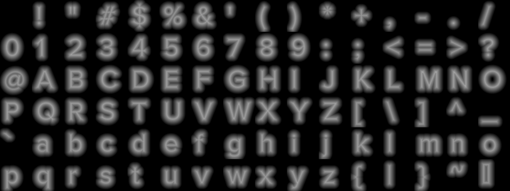
Fortunately, there are ways to fix the letter shapes. The game developer company Valve published a paper that popularized a technique called Signed Distance Fields. Essentially we just replace the texture atlas with this:
This makes a huge difference! With no other changes, Dreamler looks like this:
We can make it even better with an anti-aliased region around the edges:
Additional challenges along the way
Finding a suitable distance field-generating algorithm
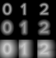
This is done offline. The goal is to, in each pixel, store the distance to the edge of the glyph shape. 127 means we’re right on the edge. 0 means we are very far from the edge, outside the glyph. 255 means we are very far but inside the glyph. The simplest algorithm you might think of is to loop through all pixels in the black&white source texture, and for each one, loop through all other pixels in the texture, and if that pixel has a different color, measure the distance, and in the end use the shortest distance. This algorithm gives perfect results, but is slow (complexity is O(w^2 * h^2) in the image width&height). A source image of 1024*1024 pixels means we’ll have to loop 1024*1024*1024*1024 = 1 099 511 627 776 times. Valve describes this as a brute-force algorithm, they also mention a small optimization and says that “The execution time for this simple brute-force method is negligible.” We disagree – doing it for all 256 glyphs in our atlas took around 20 minutes on my 8-core machine, which would be ok if we actually only did it once, but in practice, while developing, we wanted to re-generate the atlas many times to experiment with various things, and waiting 20 minutes for each experiment was a pain.
Another simple algorithm you might think of is this: Begin by setting all the pixels inside the glyphs to 0, and all others to 255. Loop through each pixel in the whole image, and if it has the value 255 and a neighbour with the value 0, set this pixel to 1. Then loop again, and if a pixel has the value 255 and a neighbour with the value 1, set this pixel to 2. Keep looping all the way to 255. Given that each pixel has 4 neighbours. we just have to loop 1024*1024*4*254 = 1 065 353 216 times. This algorithm is much faster, but unfortunately, the quality is much lower. It’s only correct for straight horizontal and vertical distances. All diagonal distances are wrong. You can say that the algorithm grows “diamond” shaped corners instead of round corners. Considering the 8 neighbours instead of 4 neighbours isn’t better either, it will just grow square corners instead.
Not happy with the results, I did a bit of searching, and found an algorithm known as 8SED or SED8, published all the way back in 1979. It’s both fast and gives almost perfect quality. The different results can be seen in the image below.
Finding the optimal width of the distance gradient
One thing that’s not discussed in the Valve paper: when we generate the atlas, what’s a good maximum distance to the edge? Anything outside this maximum distance can be completely black. Obviously, setting the maximum distance to 1 will recreate the original black&white picture. We experimented with different max distances and found that when letters are big on screen, smaller spread gives much better results! When letters are very small (too small to read anyway), a small spread makes the whole textured rectangle gray. A bigger spread also causes some artifacts, but much less. So in the end we chose to make the region 12 pixels wide. This also sets the limit to how wide you can make any faux bold/outline/glow effect.
Regardless of what you choose, you definitely want to use the range 0-255 as effectively as possible. For example, we found that our glyphs are thin, so when we set the value at glyph edges (the midpoint) to 127, and inside values to 128 129 130… we never reached 255 because the glyphs were too thin, so we were wasting some numerical precision. We can use the full range if we move the midpoint, to for example 134. Our atlas creator will automatically calculate the best midpoint, that we should use in the shader.
Tweaking the width of the anti-aliased region
By default, you’d expect the anti-aliased region to look best at 1 pixel width. But after a bit of experimentation, we found that 1.6 pixels width looks better in Dreamler. To implement this, the parameters to smoothstep() in the fragment shader should be variable. Something like smoothstep(midpoint – smoothradius, midpoint + smoothradius, value) where smoothradius varies based on how big the text is on screen. First, find the ratio of font size in the texture, to font size on the screen. In our case 64 / fontHeightOnScreen. As input, we also need the difference in gray value between neighbouring pixels in the texture, call it ‘dv’. The final formula is smoothradius = dv * (64 / fontHeightOnScreen) * 0.5 * 1.6; where the 0.5 is neccessary to convert from ‘diameter’ to ‘radius’.
Don’t use mip-mapping!
Mip-mapping doesn’t play well together with distance field text. When we turned off mip-mapping, we got a major quality boost for small text.
Future improvement
- Sharp corners
- Sub-pixel precision! We believe that Dreamler would benefit from even higher quality text rendering, especially when text is small. As your projects grow in size, you need to see lots of information on the screen at once, which implies small but highly readable text. The best quality we have seen is this.
- Performance! The bottleneck of our current solution seems to be the bus to the GPU (as detailed in our earlier blog post). Performance is still OK, but if/when we implement sub-pixel precision, we’ll definitely need to optimize further, probably with intelligent caching.
- Internationalization – support arabic, eastern asian charsets.
- Related to the aforementioned letter-spacing, in typography there is also a separate but related concept called ‘kerning‘ which applies to pairs of letters, not individual letters. If you write the two letters “VA”, thanks to their shape they could be really close together, compared to “VV”. We don’t yet support kerning in Dreamler.
Additional papers of interest
- Vector Texture Maps on the GPU
- Real-Time Rendering of Textures with Feature Curves
- Level set contour textures
- Anti-aliased Euclidean distance transform
Header image: “Words are hard to find” by Marco / Zak is licensed under CC BY 2.0










Pingback: - Dreamler Blog()
Pingback: - Dreamler Blog()
Pingback: Designing Dreamler by Jean Pichot - Dreamler Blog()
Pingback: Designing Dreamler by Jean Pichot - Dreamler Blog()