Designing Dreamler
- Oct 08, 2015
- By Jean Pichot
[This blog post by our UI Designer Jean Pichot originally appeared in the Visualoop blog on June 24, 2015]
In the beginning of May we released a first public version of Dreamler, a collaboration tool that utilizes the visual aspects of real-time multiplayer games to help people achieve a higher degree of efficiency and engagement in projects.
My first encounter with Dreamler was a year ago in May, as a freelance designer. My focus was creating animations to explore new functionalities and how these could work within the existing interface. Coding had begun a year earlier (in April 2013) and a lot of structural elements were in place, which provided room to think creatively about visual features and user interaction.
My background is in motion design and up to that point I hadn’t been exposed to much of the workflow of software design. Based in Stockholm and Gothenburg, Dreamler is a small company with a handful of talented developers from various backgrounds. Having liked the experience, I joined the team shortly after.
One of our goals during development was to strengthen the visualization of projects and this has become a key principle in how we approach both the user experience as well as the design of elements within Dreamler.
To this end, we’ve been working on a formal visual language to describe projects and all the tools that go into seeing them through.
About Dreamler
Using Dreamler, people work together in real-time using five types of building blocks to create and execute what we call project maps. Each person adds activities, resources, goals, and requests to an infinite gameboard, creating joined maps in order to successfully realize projects.
Project overview
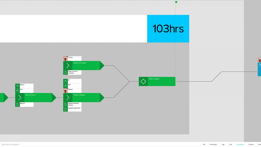
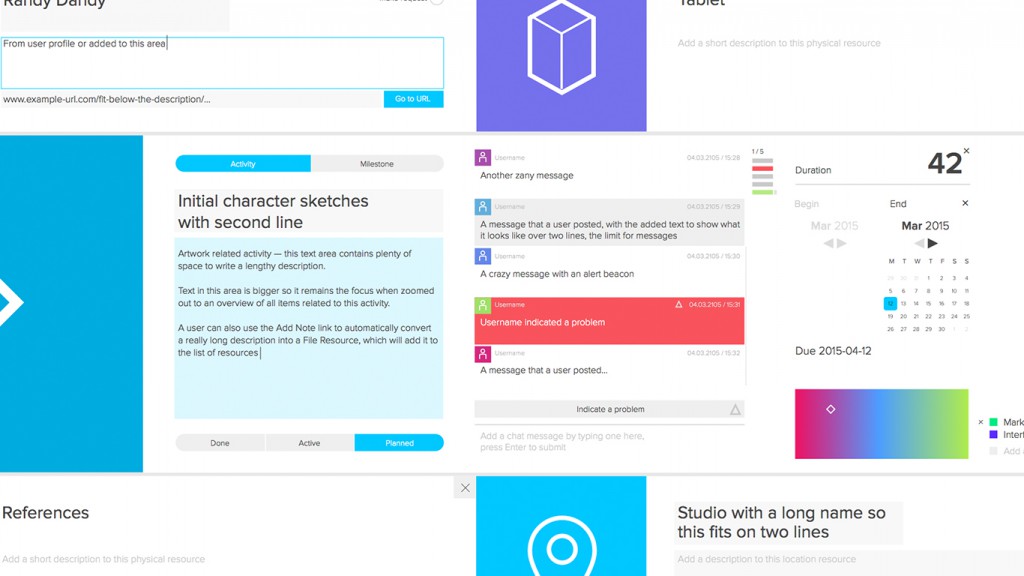
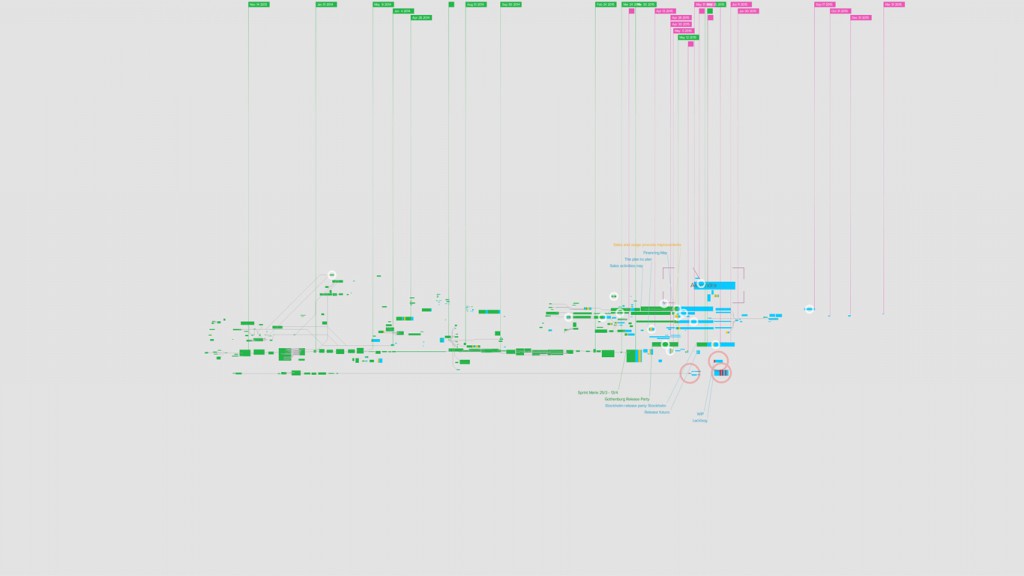
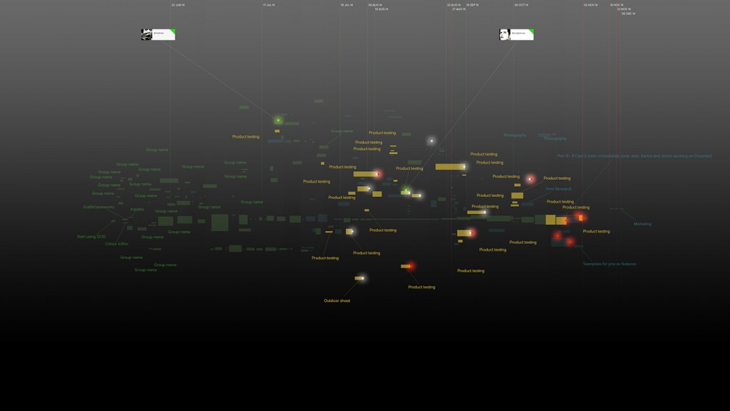
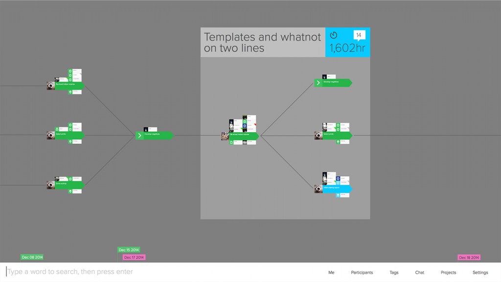
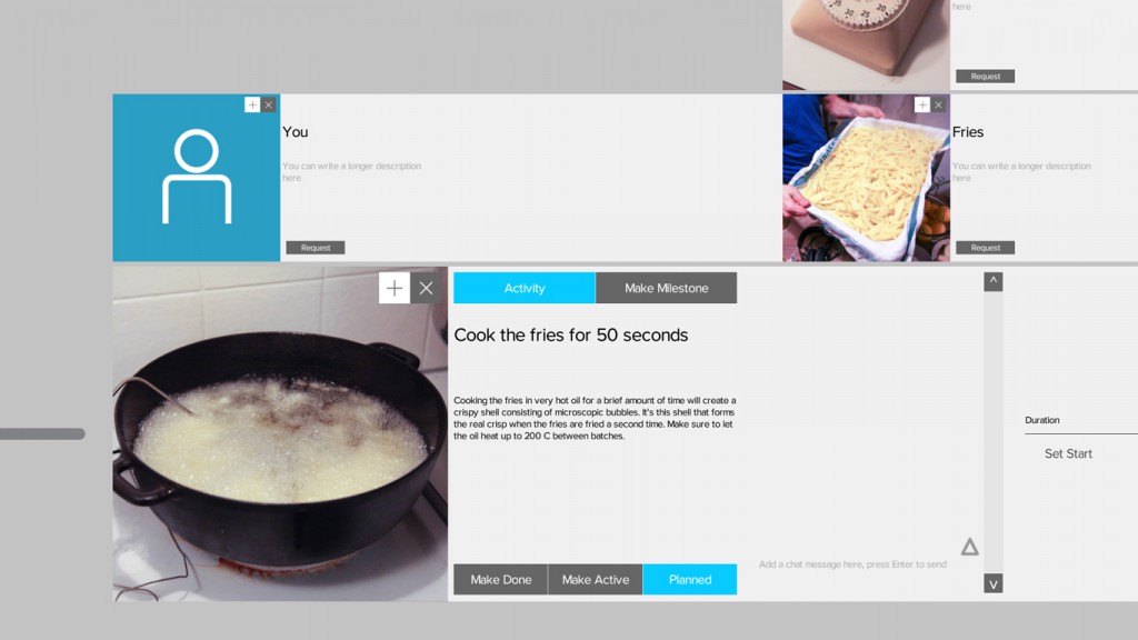
Dreamler is built for real-time interaction, no matter how remote participants in a project might be. Each person could be viewing or editing particular elements in a project at different levels of detail (LODs), and for this we designed specific types of visualizations. The lowest, LOD 0, zooms all the way into a node (called activity), effectively revealing all of its components for editing — resources, people, deadlines, chat messages, descriptions, and assets — while the highest, LOD 3, provides an aggregated overview of an entire project, focusing more on overall progress and the status of groups, while retaining the visibility of any unread messages or alerts.
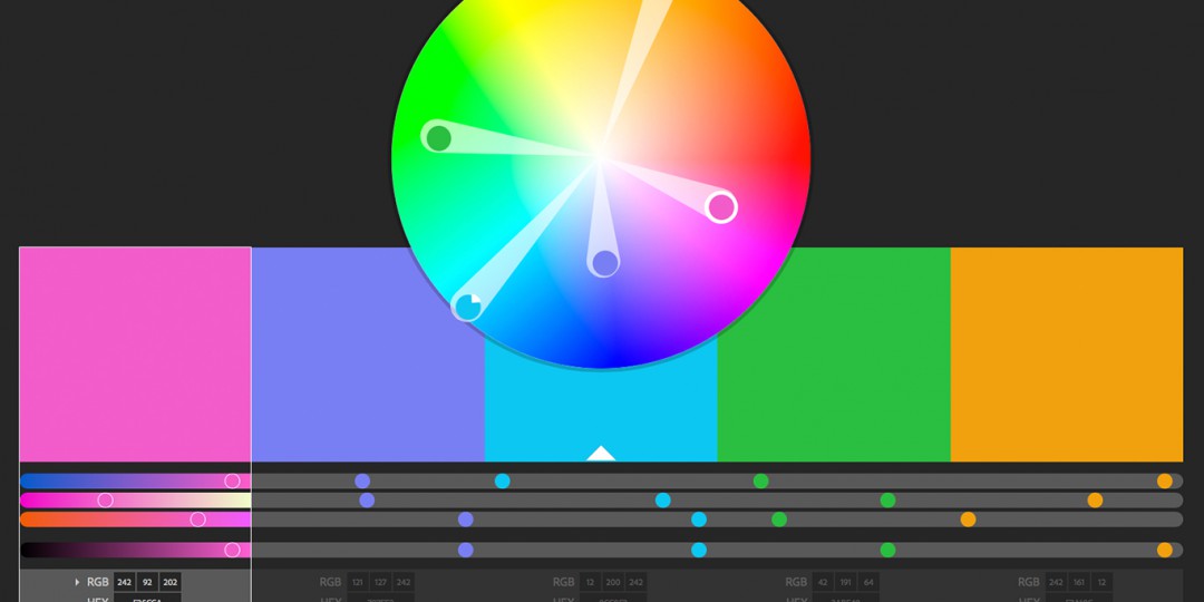
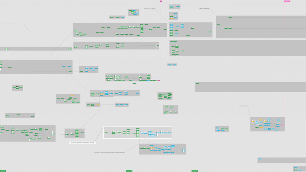
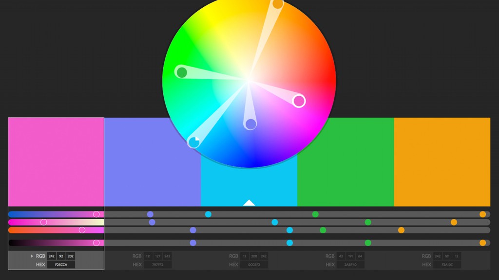
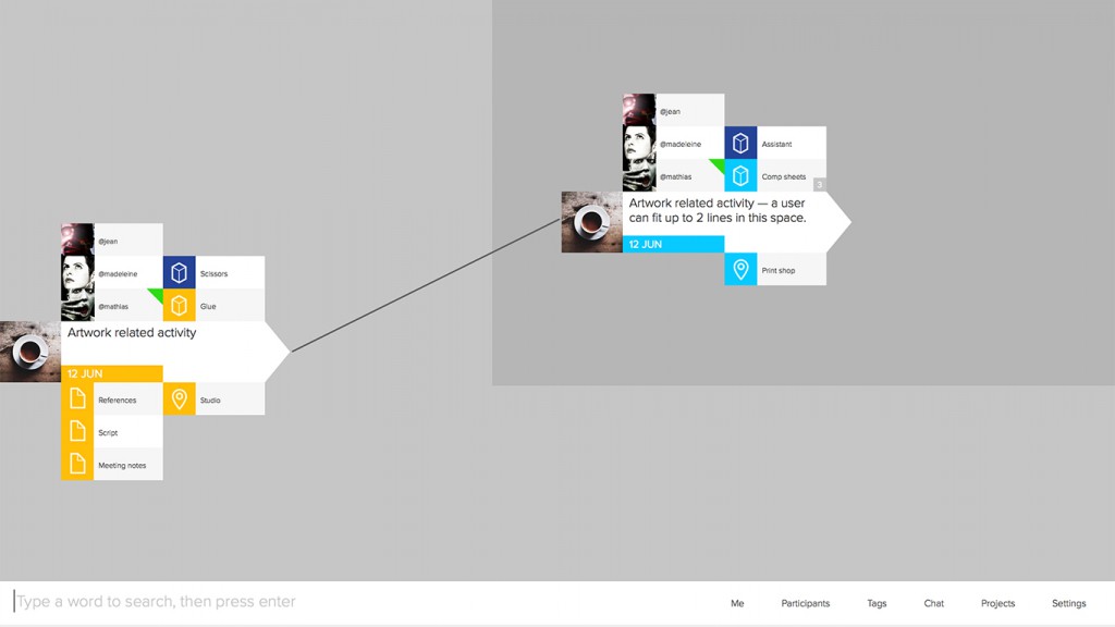
A user can freely zoom and pan within levels of detail, which allows for a fluid and immersive experience. What was important in designing this kind of inter- face was the creation of graphical elements flexible enough to be viewed and understood at different zoom levels. For this we came up with color schemes and icons as well as attention to how activities are assembled and built upon (by adding resources). This results in shapes and patterns, much in the same way regions in a map works, and together with colors and icons, form a visual language that is easy to understand and recognize when working through complex projects.
Because Dreamler is something that deals with project complexity (you have to be able to both look at an entire project as well as details within it), the map analogy is fitting: zoom out to view the entire world, zoom in to reveal street names and houses.
Having seen examples of project overviews created by some of our customers, we realized that in many cases there was usually a large disconnect be- tween detail plans and overview plans. Finding an algorithmic way of generating an overview of a project is tricky, as it should include different ways of seeing things as well as a common way of communicating to different needs. Ultimately, the point is to show less while having access to more.
Thus, the entire UI concept is based on zooming and progressive levels of details, resulting in the need for graphical elements to look good even at very close range. This includes font rendering.
In terms of development, and because of this zoomable, real-time interface, there were no off the shelf UI frameworks to suit our needs. We’ve basically had to invent and build all UI controls from scratch. The positive side is that we have complete control over everything; the downside is that even the simplest thing (such as a text box) needs to be created, which takes a lot of time.
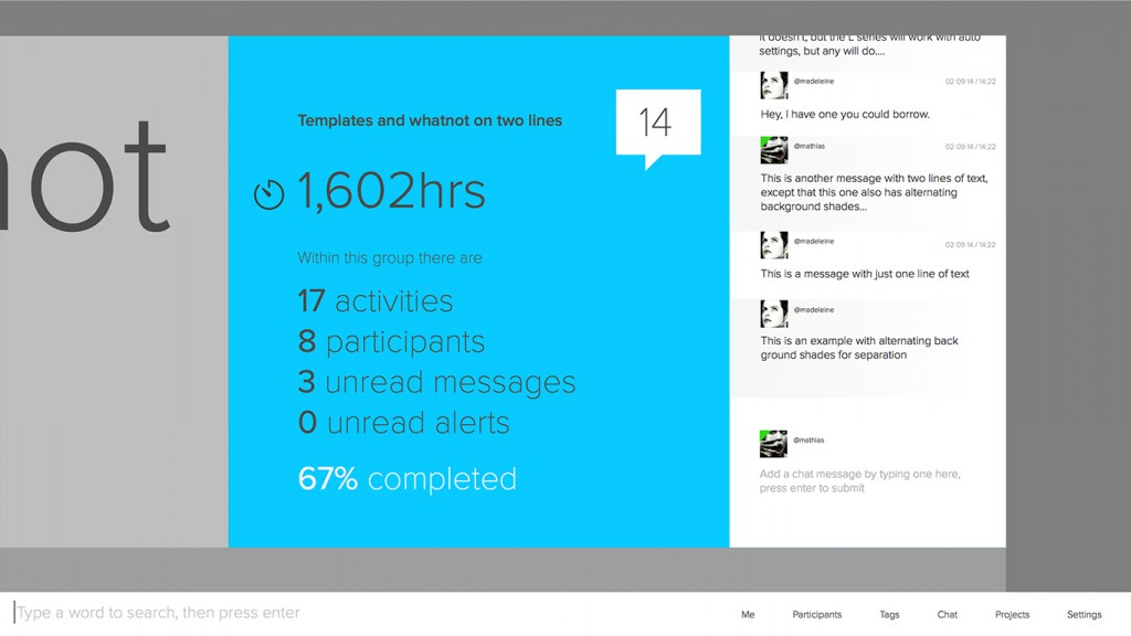
Design exploration, not implemented
Activities
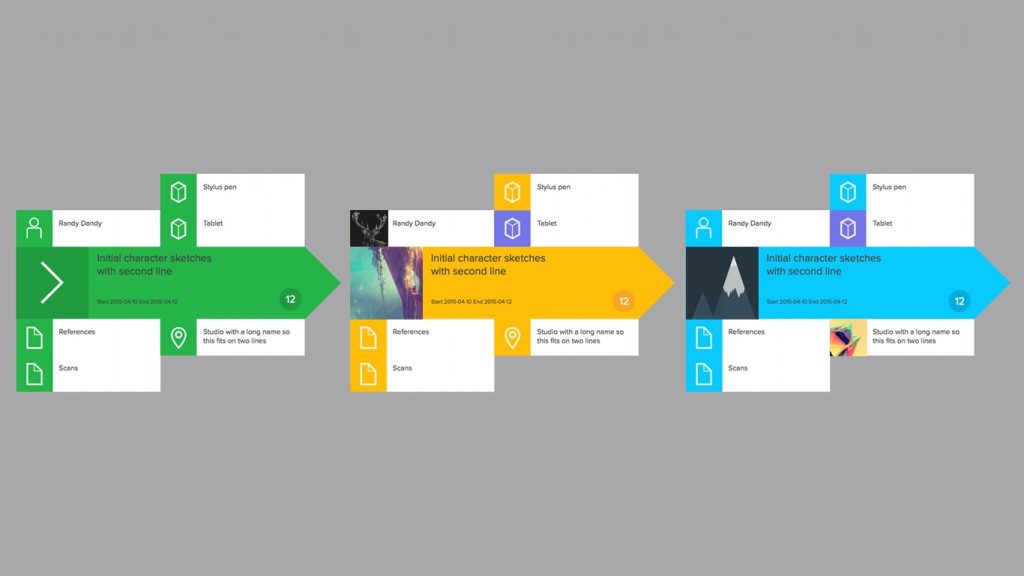
Activities have multiple states during the lifetime of a project, such as planned, active, or completed, and each of these is represented by color. When grouped, a priority system based on the status of an activity is also reflected if a user zooms out, with active ones and those with alerts being most important.
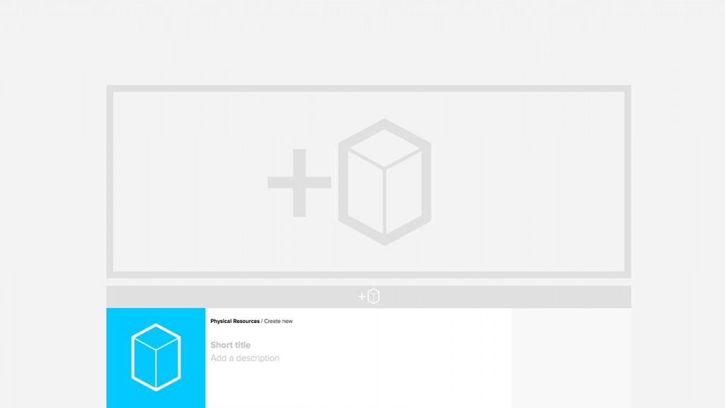
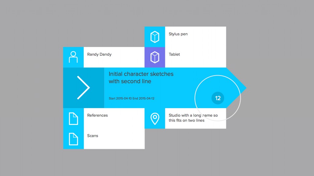
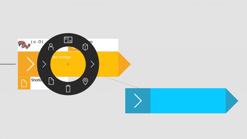
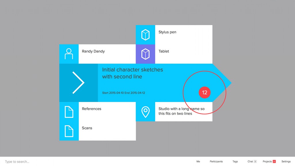
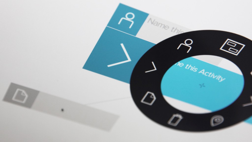
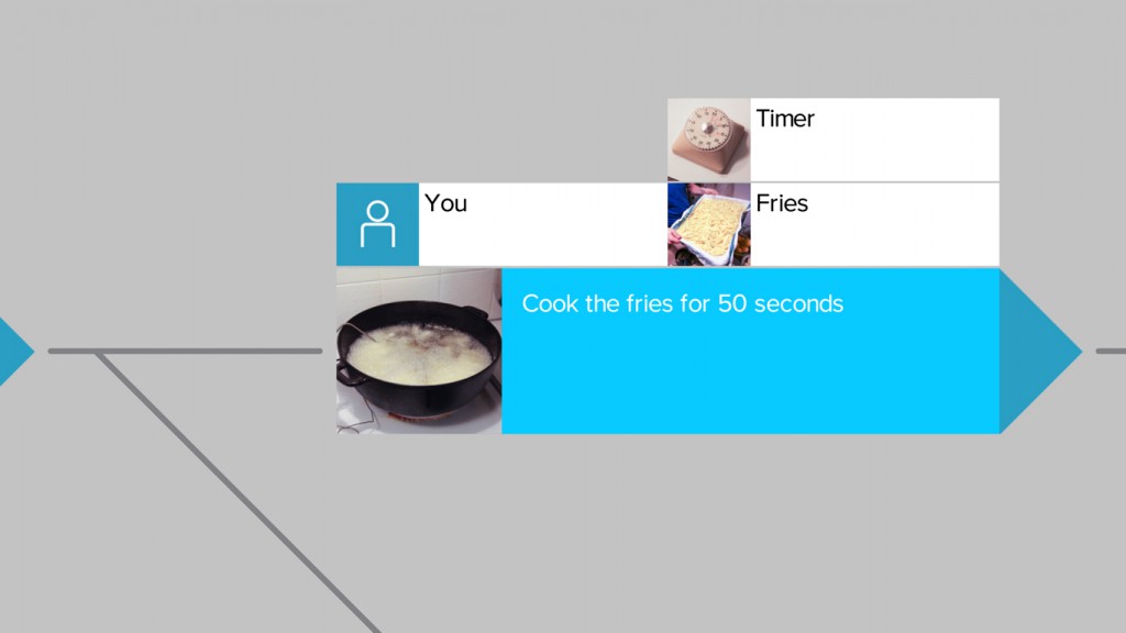
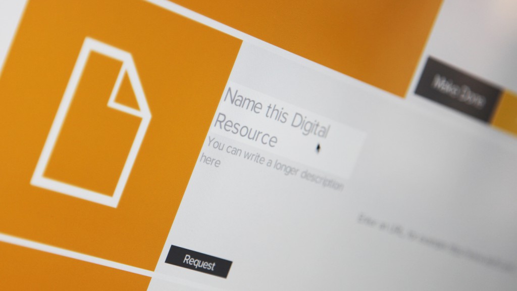
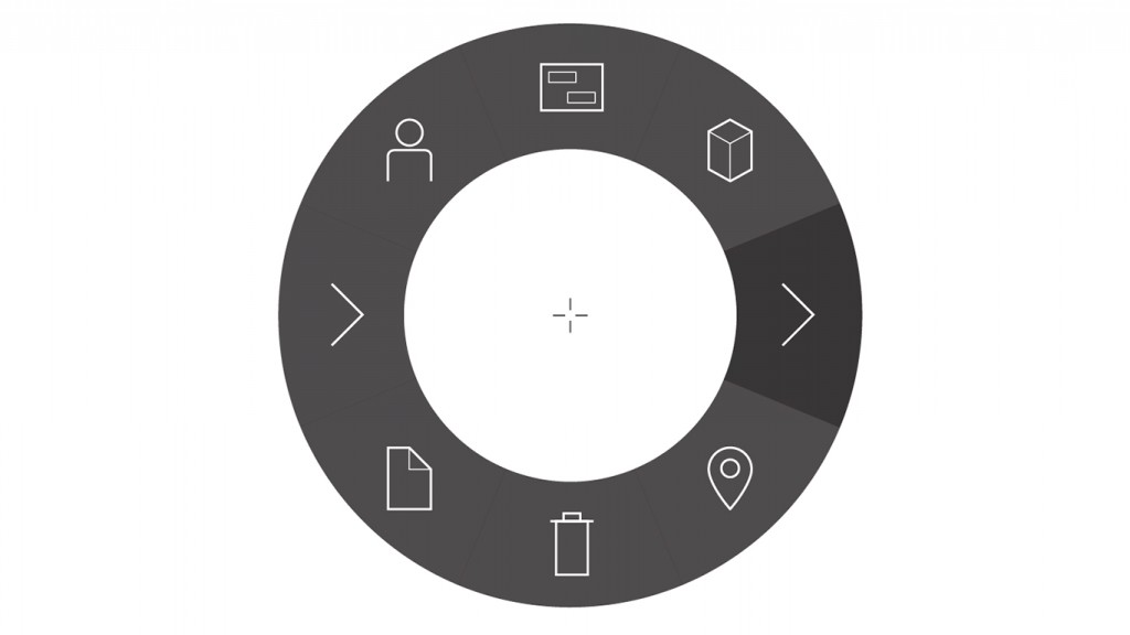
A user creates activities using the tool wheel, and these can form starting points or be linked to existing ones. They can also be linked to multiple activities and grouped, and describe a specific step in a sequence of events in a project. Resources are easily added to activities (anything necessary to help complete a task, such as people, tools, digital elements, and locations) and these can be stacked if there are many as well as set to requests.
Visually, this translates into shapes with colors and icons linked by lines (or positioned freely) in a way that creates a sequence of events. Design is purposely minimal, as details are added when zoomed in close.
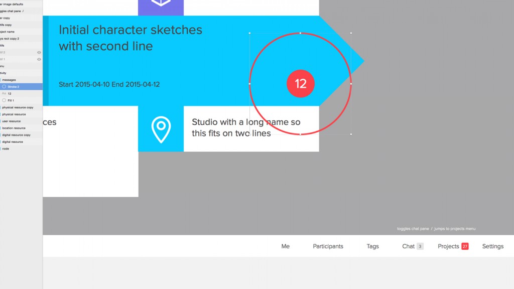
Notifications, such as beacons for alerts and new messages, add a layer of feedback when navigating large projects. All of this forms a visual flow, naturally leading from one activity to the next (or groups of activities) until milestones are reached and a project is completed.
Symbols, Text, Shapes, and Colors
The visual language makes use of symbols and icons to communicate the role many of the elements play in a project. In an effort to simplify a user’s experience, it’s important that the same symbols always mean the same thing — the arrow symbol always means an activity, a line always means a sequential dependency — and at the core of this is a formal visual language.
It’s an extremely simple language consisting of very few elements, and the syntax and semantics of the language are very primitive. Accordingly, a general design principle is what’s the simplest thing we can do, with the goal being to make it possible to learn Dreamler in a short amount of time. To just create or add features is easy, but figuring out how to do it simply is the challenge. Keeping to this goal is what guides design, and a lot of effort has gone into ensuring a short learning curve.
One example of this is the location of resources on an activity — they’re sorted by type, which and always stacked in the same relative area on all activities. This solves multiple issues, such as being able to quickly recognize and assess activities from afar, or being able to recognize resource types when images are used (which take the place of icons).
Dreamler is actually rendered in 3D using OpenGL but is presented as 2D because it’s easier to visually interpret things that way (as seen in metro maps). There’s no point in presenting it as 3D just yet, although it does open interesting possibilities for the future.
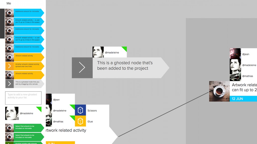
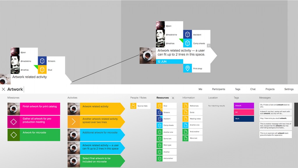
Icons, shapes, text, and colors play a large role in the design of Dreamler as they’re used throughout the software to quickly identify parts of a project or hint at functionalities. Shape and color consistency is especially important when making use of the different view options in Dreamler — a viewer can choose to see activities as a list in the Me view or activities associated with all users in the Participants view, while the Search view combines all elements in its results (more on these below).
We had to invent a method to render icons and fonts. The challenge was crisp looking typography with a lot of text on-screen without completely filling up the texture memory on the graphics card. To solve this, we came up with a solution using distance fields based rendering technology, of which you can read more about here. [http://blog.dreamler.com/font-rendering/]
All of these features need to work smoothly — Dreamler runs at 60fps, meaning all calculations that respond to user input must happen within 1/60th of a second for the experience to feel smooth.
Since it’s also a real-time environment, things might be constantly moving around as multiple users work on a project. Being able to quickly identify and manage events on the game board also means designing elements that are clear and useful.
We’re aiming for an interface that is very low friction; it should be as simple
as possible to manipulate, work with, and add things to. A game-like environment that’s unobtrusive. To this end, we verify that the language works long before we design anything fancy or good looking, as the language is as much about flow and sequence as it is the functionality of individual elements within Dreamler.
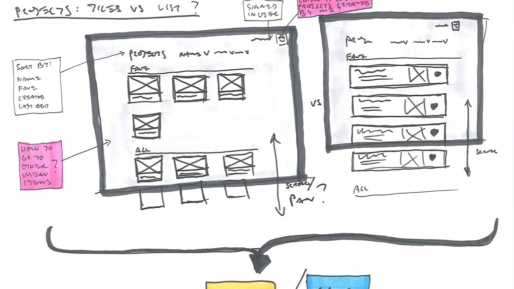
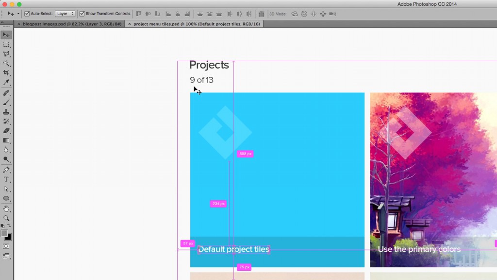
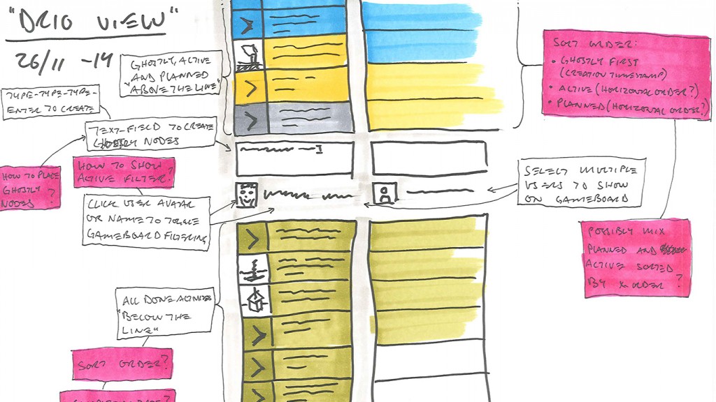
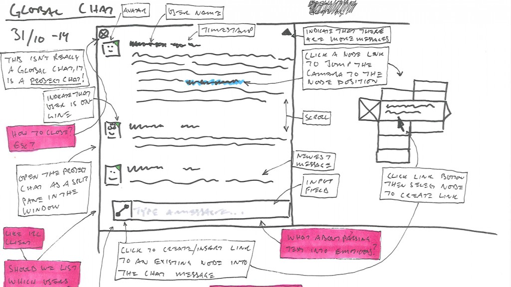
Design typically goes through a mental process of usability before following up with wireframe sketches by hand. Sometimes it goes directly into making functional prototypes with aesthetic design applied in the final stages, sometimes it goes into aesthetic design then onto implementation.
Tool wheel
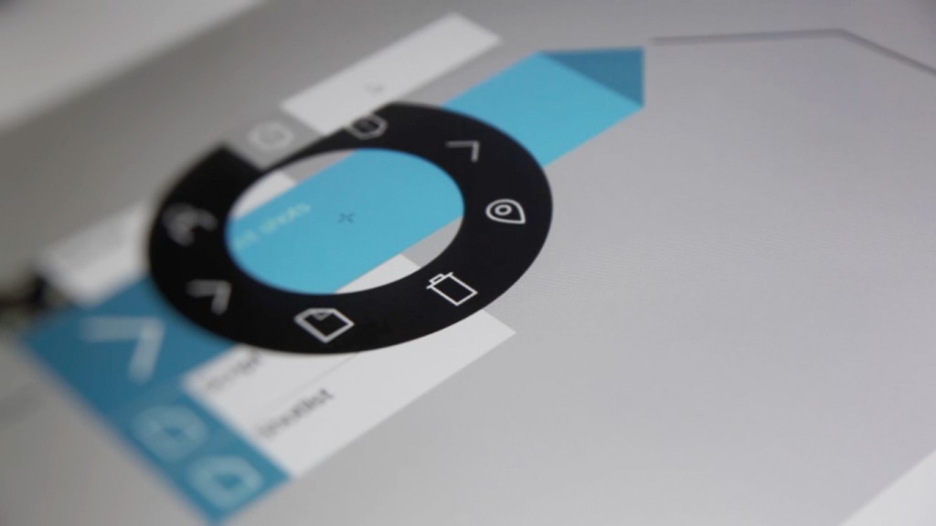
One design choice was to create a tool palette that is revealed only when needed, and opt for icons instead of text. These icons are the same as the ones used in the various components of an activity, keeping the language visual and the relationship of objects clear. It’s easy to make a menu or button that generates something, but the goal was to create a super simple multi-tool that allows for a number of actions. A tool that appears when you need it and is out of view when you’re interacting with objects on the board.
The tool wheel is still in its original iteration, but we’re now exploring ways to make it contextual and dynamic. This would provide smarter interactions with objects on the gameboard, allowing us to add usability per element as needed.
Panels
As mentioned earlier, another was to incorporate split screens — panels that slide into view and reveal other ways of looking at elements in a project. We decided to leave out divider lines, opting instead for slight changes in background colors which, along with an animated push, helps retain the openness of the gameboard. The Me view is an example of this, where a user’s activities are listed and organized by status and can be used to jump to or highlight activities on the project map, as are the Tag and Participants views.
This kind of design repurposes existing components and offers streamlined
ways of navigating through dense projects, while at the same time keeping things visually open and clean.
Conclusion
Dreamler is a work in progress as new features and functionalities are being explored. There’s a long list of design and gamification elements being worked on to further enhance the visual aspects of the app, as well as updates to inter-project communications which allow for all sorts of interesting possibilities, but for now we’re excited the first version is out and ready to be built upon.
Jean Pichot is a designer currently living in Gothenburg, Sweden. His background includes 15+ years of design, direction, and animation for broadcast and commercial projects, recently focusing on user experience and interface design at Dreamler.



Pingback: How Dreamler Can Facilitate Global Collaboration - Ekipa Blog | The Marketplace for Software Teams()
Pingback: How Dreamler Can Facilitate Global Collaboration - Ekipa Blog | The Marketplace for Software Teams()
Pingback: How Dreamler Can Facilitate Global Collaboration - Dreamler Blog()
Pingback: How Dreamler Can Facilitate Global Collaboration - Dreamler Blog()